JIU-JITSU CLUB
JIU-JITSU CLUB
Jiu-Jitsu Sports Club
BRAND & RASHGUARD DEVELOPMENT

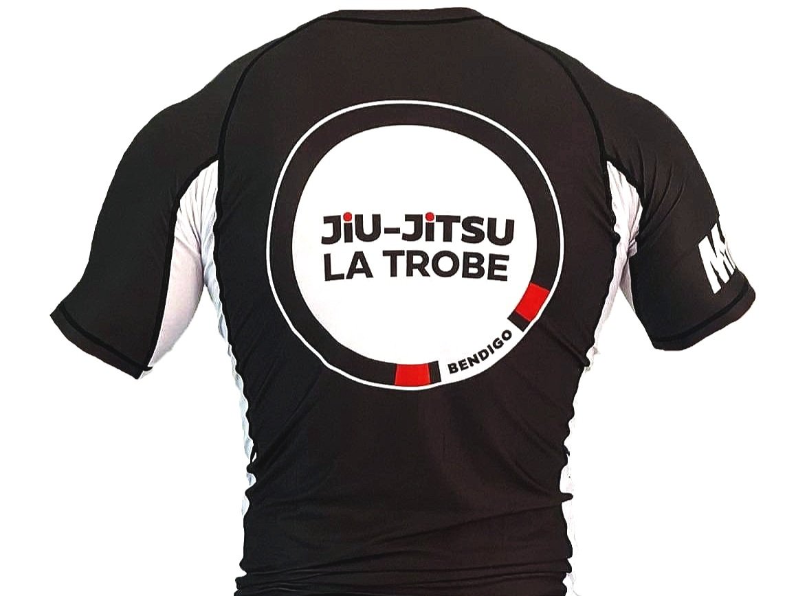
Design of a logo and Rashguard for La Trobe University’s Jiu-Jitsu sports club.
La Trobe University’s Jiu-Jitsu Sports Club logo was designed as a circular emblem to reflect the club’s strong sense of community. Formed by a coloured belt, the circle symbolises the ranking system, the belt’s practical role in securing the gi, and the energy and spirit of Jiu-Jitsu. The black and red colour palette represents the prestige of a high-ranking black belt while aligning with La Trobe’s branding. A bold sans-serif typeface reinforces the club’s values of stability and strength, mirroring the physical discipline of Jiu-Jitsu. Additionally, I worked in collaboration with a team to design the club’s rashguard, ensuring cohesive and representative branding.
Designer: Zoe Jacob
Club founder and instructor: Cooper Goulding
Rashguard manufacturer: MA1